Barrack Place

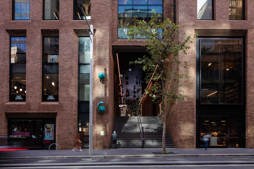
On the ground floor, a network of laneways criss-crosses the site, providing access to the small shopfronts within and opening up a through-site link between Clarence and Kent streets.
“In that part of the city, there are carriageways and accessways and little laneways that have now become cool bars and little hideaways,” Odbert explains. “We thought they were a really good reference point for our project as well, to bring that fine-grain activity to a part of the city that can be dominated by big commercial blocks.”
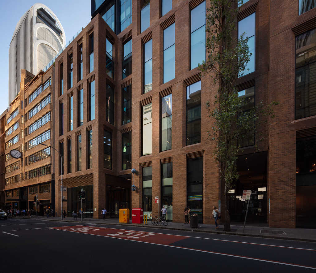
When the time came to formalise the material palette, the team were once again guided by their immediate surroundings. “On the south side of us, on both Kent Street and Clarence Street, is the Red Cross, which is an old heritage building – more Art Deco than a lot of the original warehouses, but with all-face brickwork,” says Odbert. “Then, obviously, there are the brick warehouses themselves.”
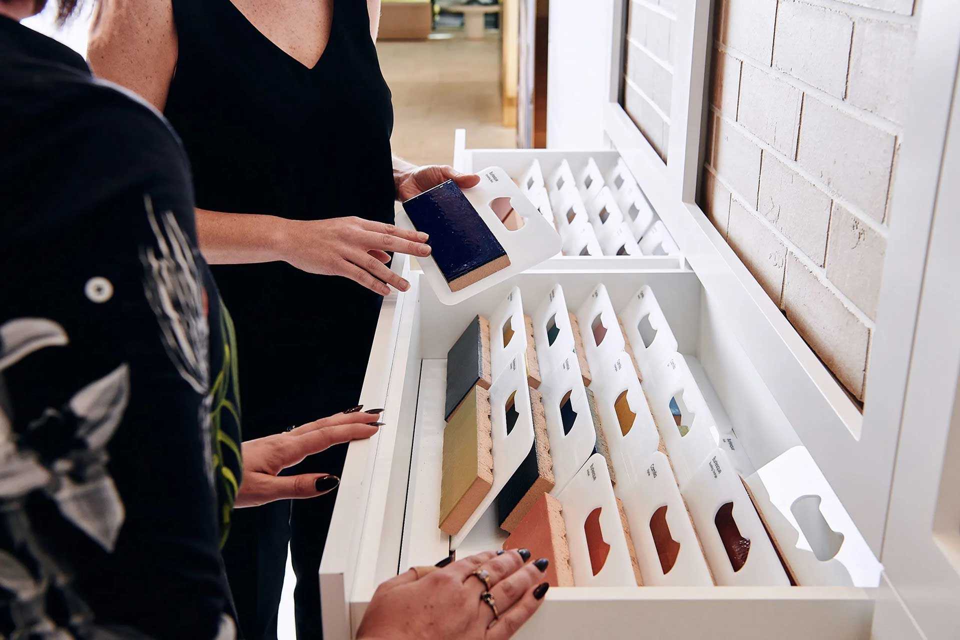
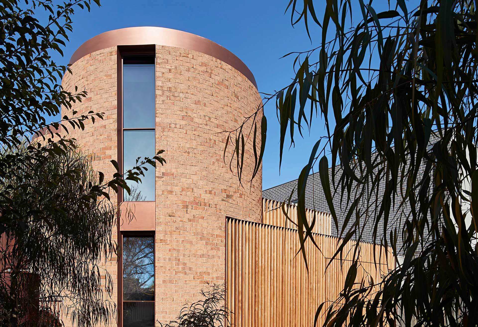
They settled on Bowral Dry Pressed bricks in ‘Bowral Brown’. “We messed around with some different bricks in terms of shade and texture and arrived at the ‘Bowral Brown’ brick, which is a reasonably modest looking brick,” says Odbert. “It’s not over the top, but we thought it would sit comfortably with the surrounding buildings and the heritage fabric of that part of the city.”
The team used the City of Sydney Council’s standard black granite footpath paving throughout the ground floor, emphasising the publicly accessible nature of the laneways. Metalwork, bleached timber cladding and other stone paving round out the palette.
“We were fortunate that we had a project in a part of the city that had a very strong character,” says Odbert. “It gave us something to work with and to respond to, and it really helped shape how the project came together.”
He adds: “The City Council certainly is making a conscious effort to get developers and architects to look at the character of their part of the city and to work with it. With their encouragement and direction, I think developers and architects are doing a better job of responding to context.”
“We messed around with different bricks in terms of shade and texture and arrived at the ‘Bowral Brown’ … we thought it would sit comfortably with the surrounding buildings and the heritage fabric of that part of the city”

“We messed around with different bricks in terms of shade and texture and arrived at the ‘Bowral Brown’ … we thought it would sit comfortably with the surrounding buildings and the heritage fabric of that part of the city”

- With their unique granular patina and tactile aesthetic, Bowral bricks are highly prized by customers, architects and designers alike, and set the standard for design and integrity. Their sharp edges and inherent character combine with the distinctive Bowral clay colours to create what can only be a Bowral Brick.
Architectus designed a building that would interface with the heritage neighbourhood of its Sydney CBD locale.
Tasked with designing a mixed-use tower on the western fringe of the Sydney CBD as part of a competitive process, the team at Architectus laced up their boots.
“We did spend quite a bit of time in the early stages of the competition literally walking the pavement and really observing the nature of the buildings in that part of the city,” says architect Colin Odbert.
The team discovered an abundance of characterful historic buildings along the surrounding streets. “We spent time looking at some of the original warehouses that, back in the late 1800s, serviced the wharfs nearby at Darling Harbour,” says Odbert.
“They tended to be narrow-fronted, six-to-eight-storey buildings, essentially masonry buildings,” he continues. “It was all about robust materials and robust detailing.”
The team’s research trips paid off: they won the competition. Their design for the building, now known as Barrack Place, comprises an eight-storey brick podium topped by a concrete-and-glass tower.
Learn about our products.
Join us at an event.
