Complexity in simplicity: Frida Escobedo’s Serpentine Pavilion

Serpentine Pavilion 2018, designed by Frida Escobedo, Serpentine Gallery, London (15 June – 7 October 2018). Photo: Iwan Baan.
The humble roof tile creates a space of refined simplicity for this year’s Serpentine Pavilion.
Frida Escobedo’s design for the 2018 Serpentine Pavilion finds complexity in simple materials. Built primarily out of stacked concrete roof tiles, Escobedo’s pavilion revisits a now familiar trope of Serpentine commissions, in the use of using basic, modular materials, to construct elegantly sculptural forms.
The Mexican architect is lauded as the youngest architect to receive the unpaid commission from the London gallery, and also the first female lead on the project since the inaugural commission from Zaha Hadid in 2000. Escobedo’s studio in Mexico City is known for their references to vernacular Mexican architecture, including the celosía, or breezeblock wall. “We usually work with simple materials – industrial materials – and we try to create more sophisticated forms or arrangements with them. It’s not about super expensive finishes, it’s about what you can create with simple things,” says Escobedo.
Serpentine Pavilion 2018, designed by Frida Escobedo, Serpentine Gallery, London (15 June – 7 October 2018) Photo: Iwan Baan.
Escobedo’s pavilion uses concrete roof tiles to make up the walls, an apparent reference to London rooves. The tiles were manufactured in the UK and specially adapted to have two holes on the short lengths to enable threading. The tiles were then stacked and threaded onto steel poles to create permeable celosía walls. These form a rectangle, which is intersected by diagonal walls that mark the entrances and divides the space into different sized spaces. A cantilevered roof covers roughly two thirds of the interior. The underside of the roof and the floor are wrapped in reflective mirrors. This offers, as wry architecture critics note, great opportunities for selfies but also adds a surrealism to the regular shape. The tiled walls are reflected in the roof where they look like the mind-bending experiments of the young architect in the movie Inception. (Elsewhere reflective surfaces in summer installations pose a threat of exacerbating sunburn and heat stroke but perhaps not in the UK.) A shallow pool along one side of the courtyard cools the area.

Frida Escobedo, Photo: Cuauhtemoc García.
After many years of very conceptual designs for the Serpentine Pavilion, (MVRDV’s 2004 pavilion was so conceptual it was unable to be built), it appears that selected architects are gravitating towards simplicity of construction, including the use of simple repeating elements. The 2016 pavilion from Bjarke Ingels Group (BIG) was created from stacking individual boxes in an undulating, tessellated pattern. The units that made up BIG’s sculptural form were initially developed as shelving units. Stacking them one on top of each other and bolting them together is a simple procedure, but the way they are stacked makes the form sophisticated and complex.
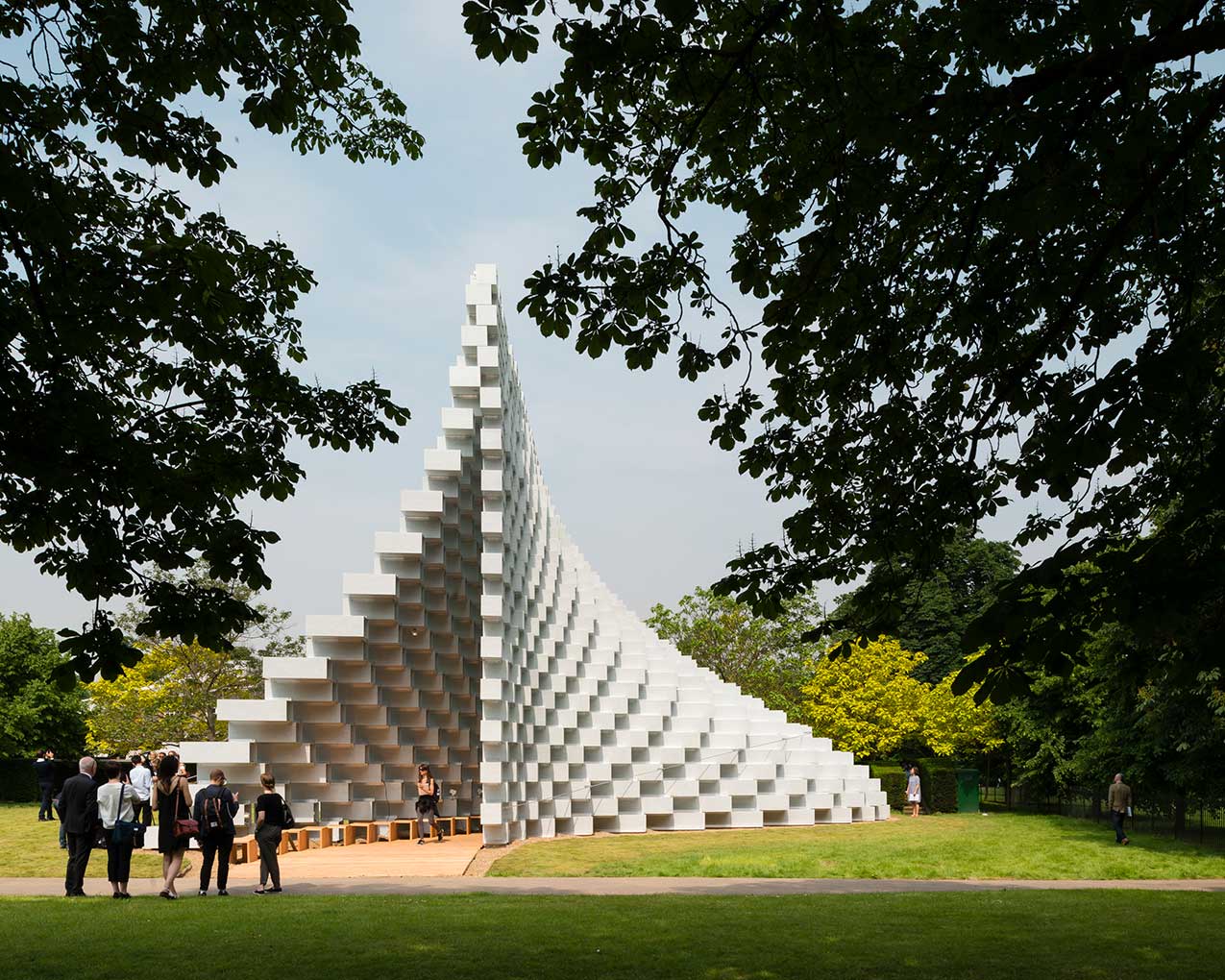
Serpentine Pavilion 2016 designed by Bjarke Ingels Group (BIG); (10 June – 9 October); Photo: Jim Stephenson.
Repetition and visual patterns also characterised Diébédo Francis Kéré’s 2017 pavilion. The Burkina-Faso born, Berlin-based architect created the pavilion perimeter by stacking indigo-blue wooden panels in a chevron pattern. Sou Fujimoto’s 2013 pavilion was perhaps the first to introduce both openness and repetition into the lexicon of Serpentine Pavilions. His white lattice of steel poles relied upon a repeating pattern of squares.
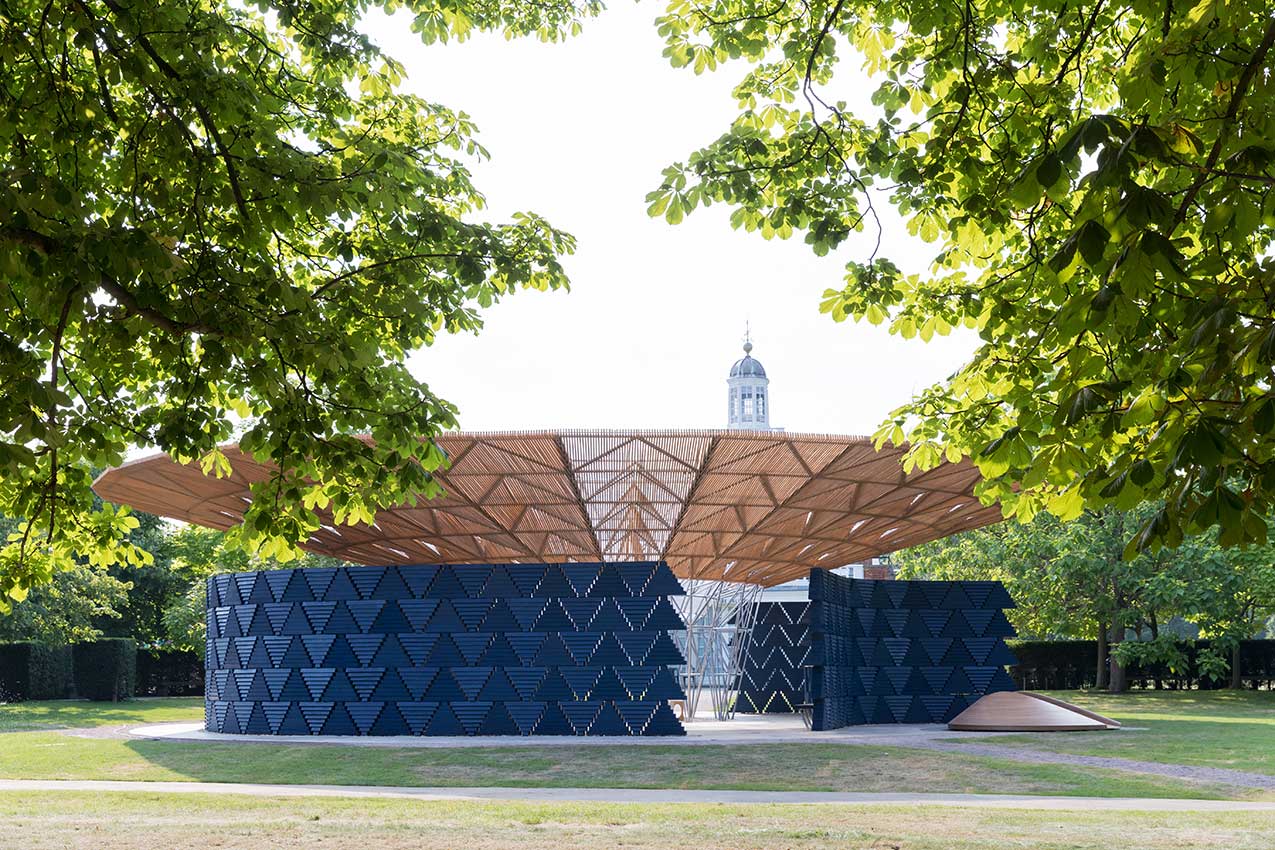
Serpentine Pavilion 2017, designed by Francis Kéré. Serpentine Gallery, London (23 June – 19 November 2017) Photo: Iwan Baan.
“We are creating this pattern [of tiles] that allows us to create a lattice instead of a wall, that has different degrees of transparency depending whether the light is hitting it on the front or from the back,” says Escobedo in an interview with the Serpentine Gallery. This statement could be true of Fujimoto’s or Ingels’ pavilions. Each uses a kind of lattice to shape a building into a sculpture. And, in turn, sculpt the experience of light and shadow within the building. The lattice creates dappled light and patterned shadow.
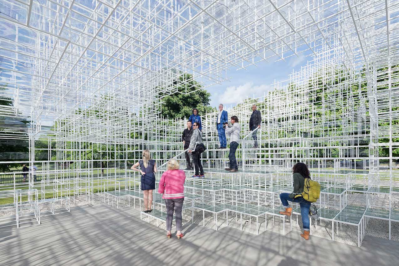
Serpentine Gallery Pavilion 2013 Designed by Sou Fujimoto, Photo: Iwan Baan.
Although much lighter in colour and density than this year’s pavilion, these predecessors share a level of calm simplicity with Escobedo’s design. The viewer can follow each segment of the structure and implicitly understand the process of construction. Standing back, the sculptural shape and pattern come into focus. At a distance, Escobedo’s pavilion looks like a wicker basket. These recent pavilions allow their structures to breathe, both literally, in that they all share breezeway walls and open panelling, and figuratively in their simple materials and simple geometry.
Learn about our products.
Join us at an event.